Thursday, December 2, 2010

book revision


Toby Shallcross
Art 201, DMF1
Fall, 2010
Final Project

BOOK
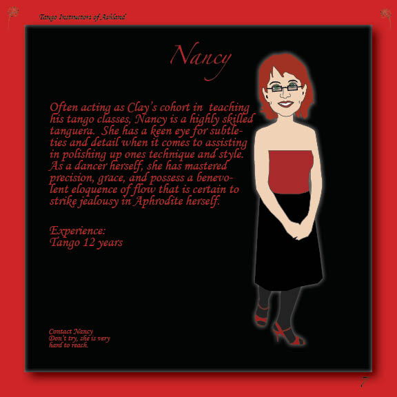
Tango Instructors of Ashland

Over the course of the term, through DMF 1 I have learned a myriad of skills and concepts anew, which I was able to apply in a very useful way through the development of this Book project.  Concepts such as use of color, balance, and composition have always been in my peripheral, and I have used them from an intuitive sense, but I am now able to apply them to my artwork consciously and with an understanding as to why. Photoshop, Illustrator and InDesign were all used and essential in completing this project.  The characters were developed in Illustrator from photographs taken of some friends of mine.  Photoshop was used to crop and alter the photos prior to their use in Illustrator.  InDesign was the primary tool used to layout the design of the book, which made it easy to experiment with various compositional formats.
The format I chose for this book was developed with the intention that the focus would be placed upon the characters themselves.  The composition was designed to be simple and balanced, with a limited palette of colors for text and backgrounds to draw the attention towards the character images.  The type chosen is curvaceous and flowing meant to be pleasing and soft to the eye, while the character cartoons are deliberately angular to create an asymmetrical balance for contrast and dynamics.  Red and black are the predominant colors used in the book, as are they traditionally a style and nuance within the general tango world itself.
As far as the production schedule for this project is concerned, I adhered as best I could to the mandate. However, even with given the projected extensions, I still found it difficult to feel as though I would meet the deadline with an adequately ironed out and finished piece of work.  There always seems like there is just one more little detail that needs some reworking, all the way down to the very last little stitch in the books bind.
I’m sure this book will end up a gift to someone, perhaps many; the characters themselves will all probably get a copy.  Who knows, with a little work, it may actually become useful to some within the local tango community…if not just entertaining to those involved.


Sunday, November 14, 2010

Dummy book

I changed my book concept...rather than doing tango drama, I have decided to do a profile on some of the tango dance instructors in Ashland.  At this point, here's what it looks like.


Sunday, November 7, 2010

Book Proposal

Tango Drama

I dance the tango, and have found a number of romantic dramas ensuing within the Ashland "tango scene."  After-all, what would be tango without fully developed dramatic appeal.   I have decided to take it upon myself the duty of documenting some of the most and enticing drama relations within this beloved community.

To start, I have considered creating a few cartoon characters, and accentuating some of the characters most prominent features.  Here is a rather bland example of perhaps one of my characters that I have created using photoshop and illustrator.  I may opt to make create this book in a comic book style.


Monday, November 1, 2010

poster


Based on the photographs and ideas I had in my head, I chose to do a mock band poster and a propaganda poster. 

Layers became a very critical part of this project for me, mainly because I needed to be able to view various images against one another to see if they would work well enough together for the composition.  I also used the posterise adjustment layer on both posters to limit the colors on the photographs I used.

One technique I attempted to employ to catch peoples eye was the use of red and yellow (bright colors) in contrast to dark colors.   Just to make it interesting, I decided to write my band poster in Russian, although I know nothing of the language and culture.


Monday, October 25, 2010

Picture


Portraits

Melissa
Elijah
self
Alphabet soup
x
I

H

Q

O

I learned the most from the “Alphabet Soup” part of the this project because I got me looking a lot more closely at the shapes and colors of the natural surroundings.  It was also a really wonderful time to be out doing that kind of exercise because of all the autumn colors.

Through exploring the various functions of my digital camera, I discovered that I could get it to recognize specific colors, like the reds in portraits of two friends (Elijah’s lips and Melissa’s hat) and self (face and shirt), and it would make the rest of the photograph black and white.  Pretty cool feature, I thought.

I cropped Elijah's portrait to put more focus on his smug facial expression.


Sunday, October 10, 2010

Project 2: Toy


Stimpy!

            I chose Stimpy, from the cartoon series Ren and Stimpy, because he left a profound impact on my psyche when I was young.  I like Stimpy, he is a simple character, and not only in appearance.  The simplicity of his appearance, did however, make it easy for me to keep my palette limited.  I took an image from the web, copied from the shapes and replicated colors with the eyedropper tool. 
            I started with the majority of colors, red for most of the body and head.  Then I colored the belly of the torso white, and copied and pasted Stimpy’s face from the image that I took.  I used the eraser and brush tools to adjust a few details around the head, and then drew in some ears and creases on the belly to finish it.  If I had more time and know how, to make it more accurate, I would have created the ears and perhaps the tong from separate pieces of paper.  Ren is next!
            I could agree with Chris Beaumont’s statement that Cubeecraft "appeals to a visceral need to build, and a cultural need to represent our ideas in abbreviated fashion".  Our culture is becoming lazy, less and less hands on, more automated all the time; with all the technological advancements, we are less likely to interact with our world in any real physical sense.  So it is refreshing to take the flat and intangible into our three dimensional reality.  And, in an age where information is rampant, and life can seem so complex, it is quite nice to break things down to their simplest form of expression.

Friday, October 1, 2010

Scratch Projects

Prior to my work on this project I had never truly used Photoshop to create anything from "scratch".  My knowledge and experience to this point was very remedial, as I had only used the application to alter photographs slightly.  Honestly, unlike most younger people these days, I really didn't think I knew anything about it (computers in general), and I thought it was going to be a struggle; however, when I got started I found that I remembered more than anticipated.  

SCRATCH 1 - HEART ADRIFT


The general concept of Scratch 1 came to me the other night as I lay in bed feeling my heart breaking to pieces.  We have all had this experience, or something similar to one degree or another.  Most have also had someone tell them at some point to "follow your heart", but rarely does anyone suggest what that actually feels like and how we aught to go about doing it.  And to complicate things, what is one to do when their heart is being broken and pulled in multiple directions? Where are we to go then?

I didn't really have much of a plan, but the image progressed rather nicely.  I took this concept and tried drawing some hearts in Photoshop.  First I attempted to use the paintbrush tool and mouse, but this frustrated me.  Then I tried the drawing pad, and still couldn't get the desired results I wanted.  Finally I went to the custom shape tool and to my delight I found a heart shape already designed into the tool.  From here I lassoed three pieces of the heart and moved them slightly away from one another.  I gave the heart pieces a brown color with the paint can tool and the background (a separate layer) blue; this was to conceptually emulate the earths landmasses adrift on the ocean.  I added the text layer, and lastly a few arrows and some riffle marks with the paintbrush for a little dynamics.  I decided it was finished because it expressed my feelings revolving around heart matters.

SCRATCH 2 - PREFERENCE

I was thinking bikes, but had no other ideas beyond that for Scratch 2.  One discovery I made in the process of creating this image was that Photoshop likes to make a new layer for each new shape you create with the shape tool.  This was contrary to my preferences, and it was a rather painful learning experience trying to figure out how to put shapes on the same layer. In the end, however, I managed.  I discovered how to replicate specific images by clicking on that image (in this case the bike frame) with the move tool and holding the option key and...presto!...you drag away a copy of the image leaving the original behind. This proved to proved to be fun and useful for Scratch 3 as follows as well.

SCRATCH 3 - PENT UP


I don't like Scratch 3.  Nothing about it appeals to me, and it makes me feel uneasy.  I began with a fill layer and worked with the lasso and marquee tools to create these four shapes.  To define the borders of each shape I used the stroke (outline) function.  I filled each shape then played with their placement and relation to one another by rearranging them as layers.  In the end I grabbed multiple copies of each shape with the aforementioned function above.  I decided it was finished when I realized that I hated it so much.  It's too busy and lacks any coherency. 

My favorite tool to use was being able to take a piece of the object, and then move it slightly to give it a broken and drifting look. In my opinion, the Heart Adrift is my best image.  It is simple, but is suggestive of something that I believe we all struggle with from time to time.